Developing Terminal Grid Watchtower took about a year and I primarily worked on it in my freetime after work and on the weekends. Through developing Terminal Grid I learned about programming in gamemaker, game design, pixel art, trouble shooting, how to get audience design feedback, and how to conduct user play testing.
I learned to develop this game through Heartbeast’s Youtube tutorials on making an RPG in Gamemaker. This tutorial really helped me create the building blocks and base of my game to work with. Then I used other tutorials and forums to further develop the game into what I wanted. So through out this process the game went through some changes and I encountered difficulties.
Why I added puzzles
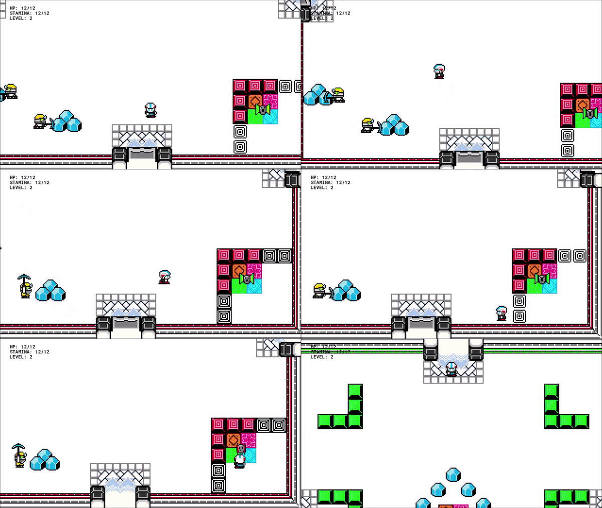
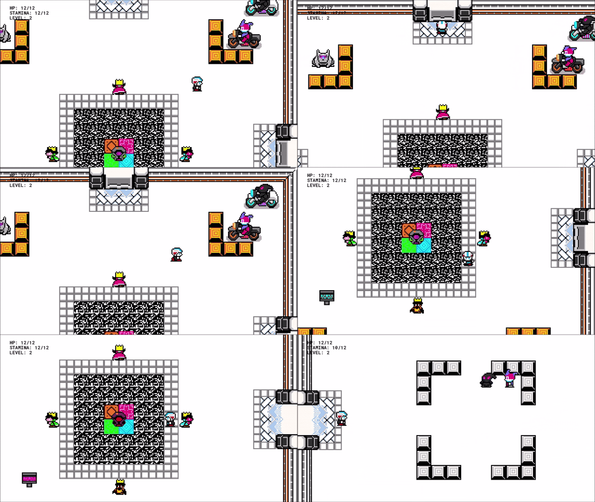
Through using the Heartbeast tutorials I had a game where the player could Dash and Shoot. I liked these abilities and they were fun for combat but these abilities needed to have a dual purpose to be fully utilized.
So I created puzzles that required the Dash and Shoot to solve them.
Adding Visual Effects
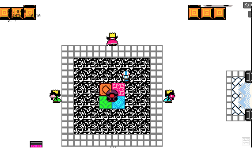
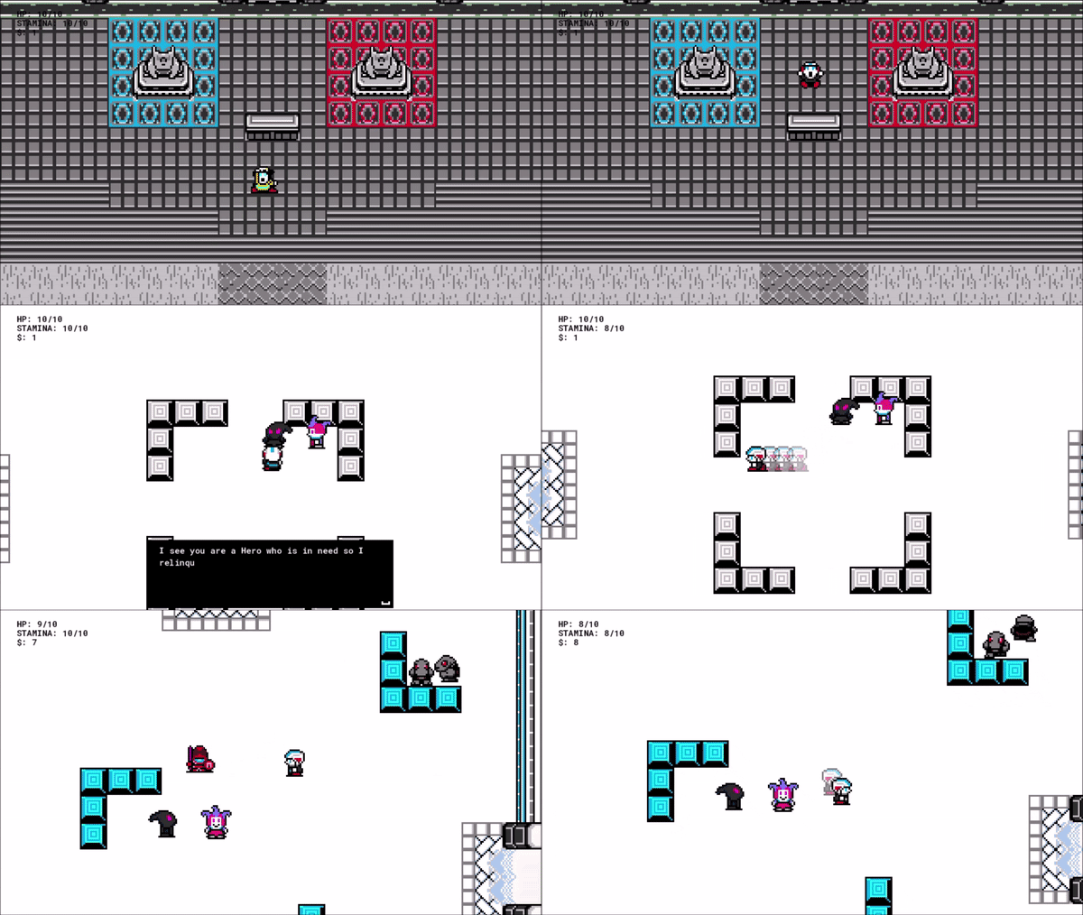
Then at one point the game was looking good and it was functional enough to have friend’s start play testing the game and giving me feedback. After a couple of play testes I learned that the players didn’t understand the transformation scene or when a new power had been unlocked. So I created a simple VFX to better convey visually what was happening. Then I took this VFX modified it and added it to when an enemy died. This made the combat more satisfying and better conveyed they died. Compared to the enemy just disappearing.
Updating Room Graphics
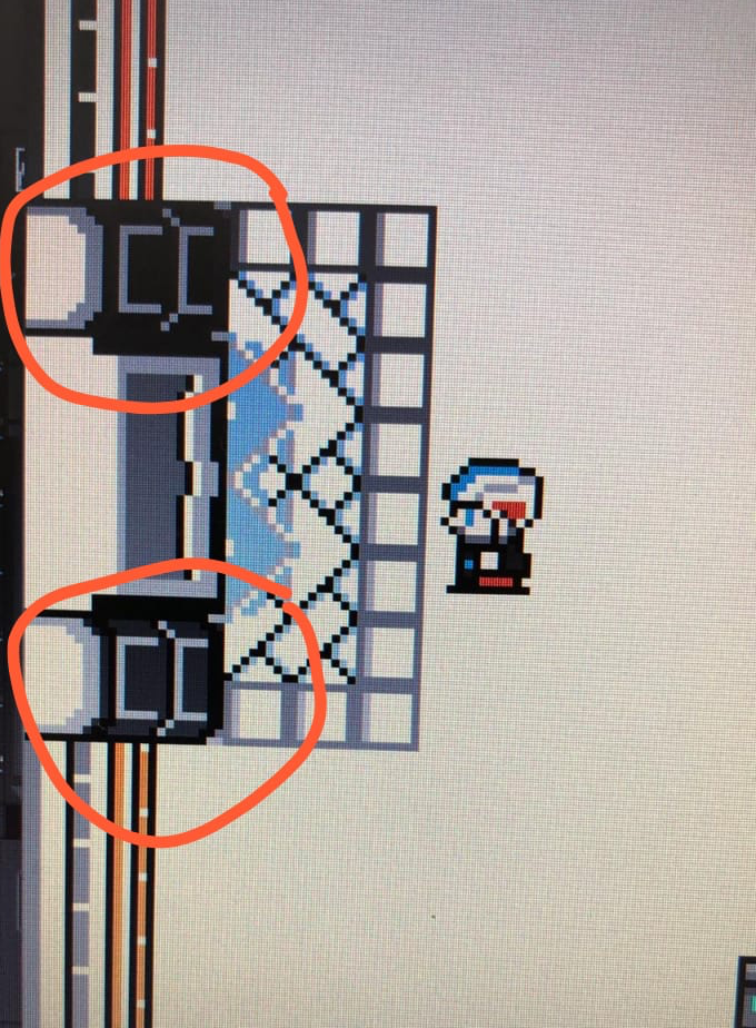
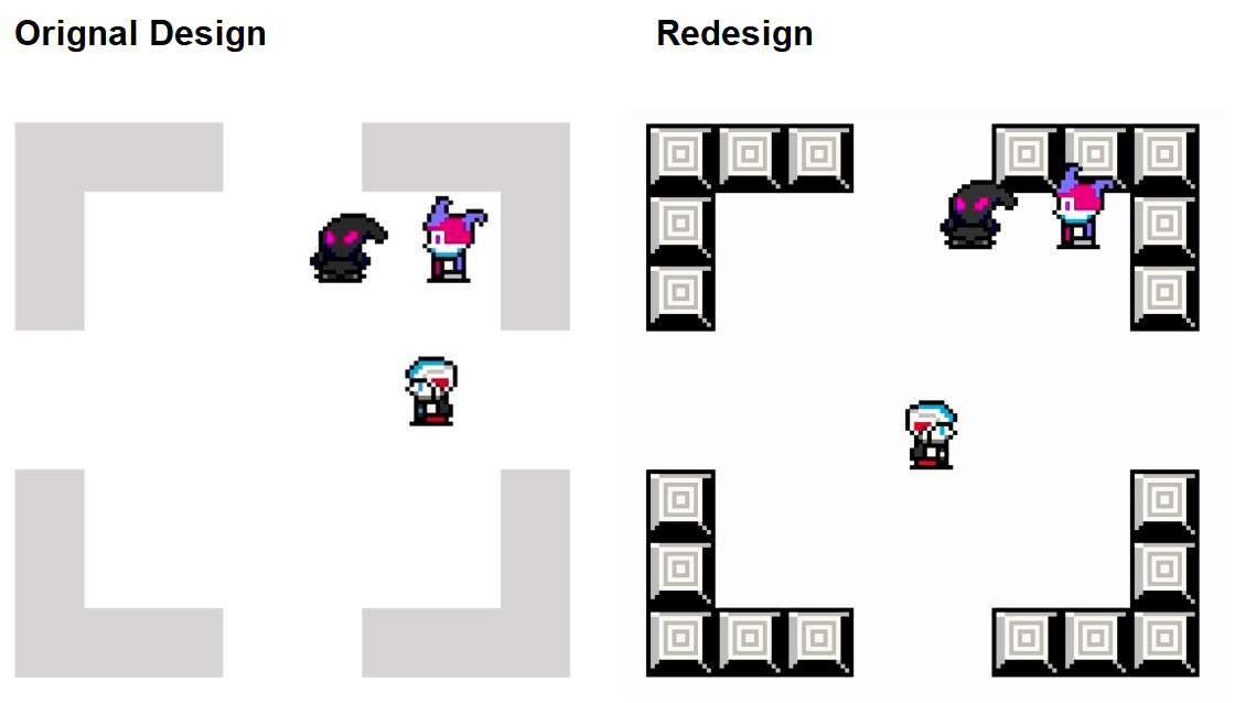
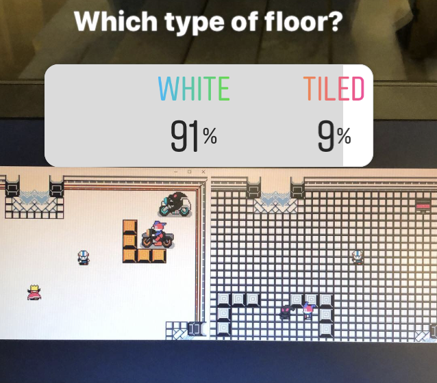
The first version of Terminal Grid had very simple graphics for the rooms. After some user play testing the feedback I got was it looked unfinished and people didn’t understand what exactly the walls were. This led to updating the walls, blocks, and doors. Then I used audience feedback through my Instagram polling to decide if white floors or tiled floors were better.

Simplified Controls UX/UI
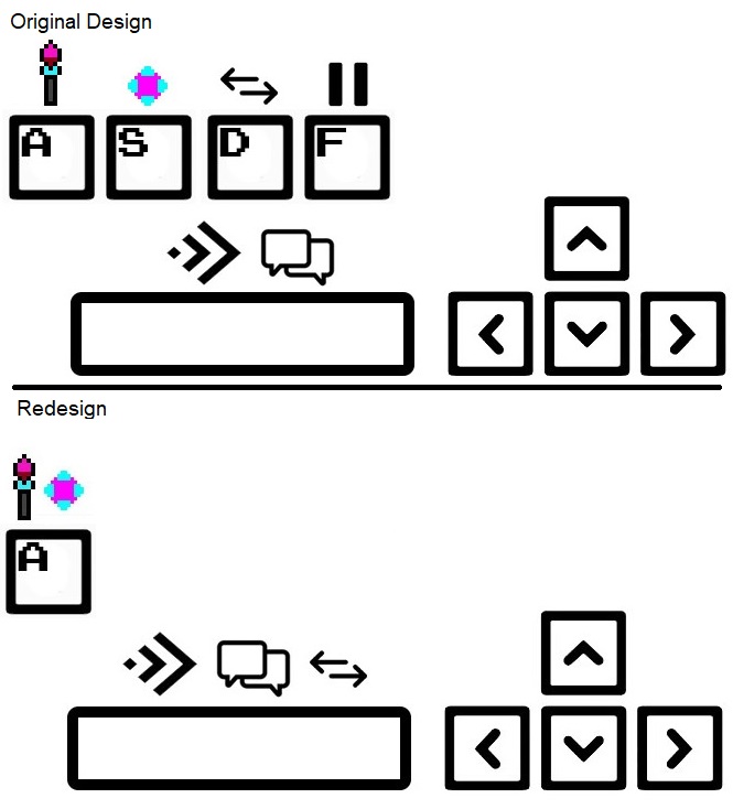
The first version of Terminal Grid had many buttons to do different actions in the game. It was very complicated and hard to remember for a player. So following Dieter Ram’s rules: “Good Design is as little design as possible” and “Good design makes a product understandable” I decided to make the controls simpler with fewer buttons.
Redesign for Visual Impairment
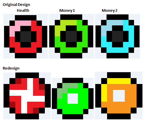
The first version of Terminal Grid had very simple looking items that killed enemies would drop such as health and money. The only difference between them was color and they all made the same sound when picked up. This could be very difficult for someone with visual disability such as color blindness.
So I went through and made each item unique in design and also added different sound effects when the player picked them up.
Other Challenges & Changes:
- Improving & Simplifying the story several times and doing an intro scene
- Enemies not doing damage after a software update.
- Creating animated cut scenes & Intro Menu
- Respawn system & final room creating Boss & Walls
- Trouble shooting laggy gameplay on the boss fight.
- Fixing skippable rooms that were discovered through friend’s play testing game
- Fixing dash glitching through walls & blocked doors discovered through friend’s play testing game
